This drawing effect from photoshopstar.com is nifty, but I thought it was going to have more of a punch than my photo has. Perhaps I need more of a cleaner photograph instead of one with all the lines and shapes mine has. Either way, I still think my end result is cool.
This tutorial from photoshopstar.com on making a photo have a canvas texture was pretty fun. I'm always amazing by repeating a filter effect several times and getting something so different, like lines on from a canvas!
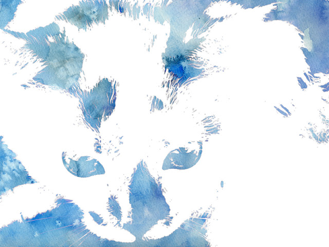
I must be a glutton for punishment because I'm trying a 4th watercolor tutorial. This time it's from photoshopstar.com. All in all, this one isn't half bad. It's written clearly and the end result is pretty good. I think I like Journal #029's the best, and Journal #003 & Journal #023 the very least!
This Art Fragmentation tutorial from photoshopstar.com seemed kind of lame at first, but now that I see the final result I think it's pretty sweet. I'm diggin' the contrast and saturation, and the blur border is decorating more than I thought it would.
This sketch shading tutorial from photoshopstar.com was very new to me because it did most of it's effects in then channels menu instead of the layers menu.
I thought it would be whimsical to use the Carpet tutorial from photoshopstar.com and apply it to a inorganic object, like this Corvette. However, it doesn't seem to work as well on smooth surfaces. Perhaps a more textured surface like fure or leaves would work better for this technique.
This super subtle tutorial is from photshopstar.com and is for realistic tears. I thought it would be fun to put a realistic tear on something not real. I had to play around with the settings a bit to make it work for my image, but I am happy with the end result.
While this is more of an update for CS6, the Hidden Photoshop Toning tutorial from photoshopessentials.com has made me aware of a whole new set of tools in Photoshop, which is what the Photoshop Journal is all about. There are so many hidden tonal presets in Photoshop that I was unaware of and now know about. I can see myself digging into these bad boys in the futre and having some fun with them.
This photo of Muni's F line was perfect for bioburst.com's old timey tutorial. I really liked how this turned out. I even added a white stroke around the photo to give it an old time photo feel.
Wow, this HDR tutorial from nill.cz was horribly written. I don't think I've had a harder time trying to figure out what was going on in a tutorial. The end result looks cool, but I'm not sure if I did all the steps as intended.
Here is a dreamy glow tutorial from niftytutorials.com. It worked better for me when I inverted my foreground and background layers in the diffused glow filter, instead of having them spec'd like the tutorial.
This stone engraving tutorial from psd-dude.com turned out to be a bit wonky. I suppose my final image looks like it could be engraved in stone, but it doesn't really seem too realistic.
Finnally, a water color tutorial that worked out well for me! I guess a third time is a charm! (Remember Journal #003 & Journal #023?) This winning tutorial came from psy-dude.com. I must say, I'm pleased with the results!
Here is another Boston photo of mine, this time with a tilt shift look to it thanks to photoshopessentials.com's tutorial. This was actually a lot of fun and simple to do. It reminds me of my friend Justin's photo of San Francisco!
This arial photo of Boston I took is made more interesting with the infrared glow technique from photoshopessentials.com. I learned some ways to adjust black and white images from this tutorial, which will help me further down the road for sure. So while this tutorial may have been simple, it has been a very helpful lesson.
Here is another comic tutorial, from sulfar. The tutorial leaves a lot of room for personal choices, which is why maybe my photo didn't come out quite like the sample. However, I still think my photo came out really interesting. I'm going to have to use some of the techniques in this tutorial again.
This filmstrip tutorial from psd-dude.com was super frustrating. It may look simple, but it requires making a vector image in Photoshop. I will never understand people who use Photoshop for vector images, and Illustrator for rastor images. It can be done, but the tools are not designed for it and that made making the filmstrip and the holes super annoying. If I were to do this again without following the tutorial, I would make the filmstrip in illustrator and just import the touched up photo in there and call it a day.
Well, I'm just not doing very well with watercolor tutorials. As you might recall, my Journal #003 was also a watercolor, and it didn't turn out so well. I decided to try a different watercolor tutorial, this time from kailoon.com, and it also didn't turn out too well. I mean, I like the final result, but it doesn't look too much like water color. Perhaps I needed more color in my image?
This bubble tutorial from goscreative was easy to follow. My bubble however didn't turn out quite like the sample, but I believe that to be a cause of the photograph and not the technique. Overall, it's a fun way to add some whimsy to a photo.
I'm not super happy with psd.tutsplus.com's "Super Slick Dusky Lighting Effects" tutorial. I think my image looks a bit silly, and I couldn't work it to make it pop like the sample photo.